It’s been a while since V2.0a1 was released. Lots of bugs have been fixed, features improved and added, etc. However, we’re still a fair way away from V2.0b1, so I thought I’d just show some of the more extensive changes that will be coming your way.
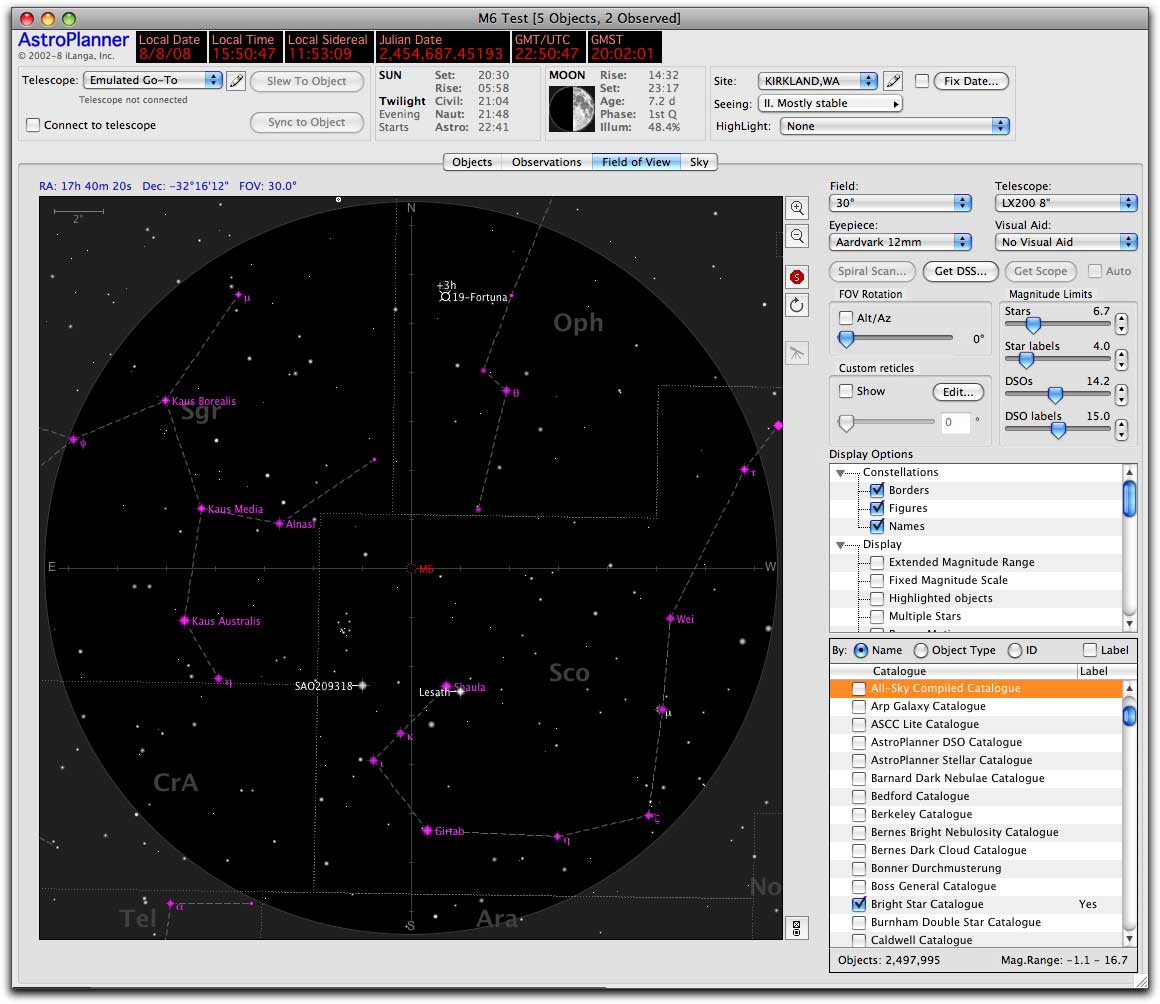
Field of View tab
Apart from some re-arranging and removal of redundant stuff, this is mostly the same stuff as before, but with a somewhat improved interface.
The Display Options are now arranged in a hierarchical fashion within categories.
The Catalogue selector is also arranged hierarchically, so you can more easily find, and turn on/off display of catalogues. e.g. if you wanted to display all catalogues containing planetary nebulae, you’d select the By: Object Type setting, find the Planetary Nebula section and click the section checkbox, which would then choose all the enclosed catalogues for you.
Constructing the FOV chart is now threaded, so there’s no more 5…4…3…2..1 countdown. It starts work immediately. If you subsequently change a setting, it just starts again.
Finally, this particular example shows a requested feature in action: the automatic colouring of major constellation stars (i.e. those that make up the constellation figure.
Catalogue window
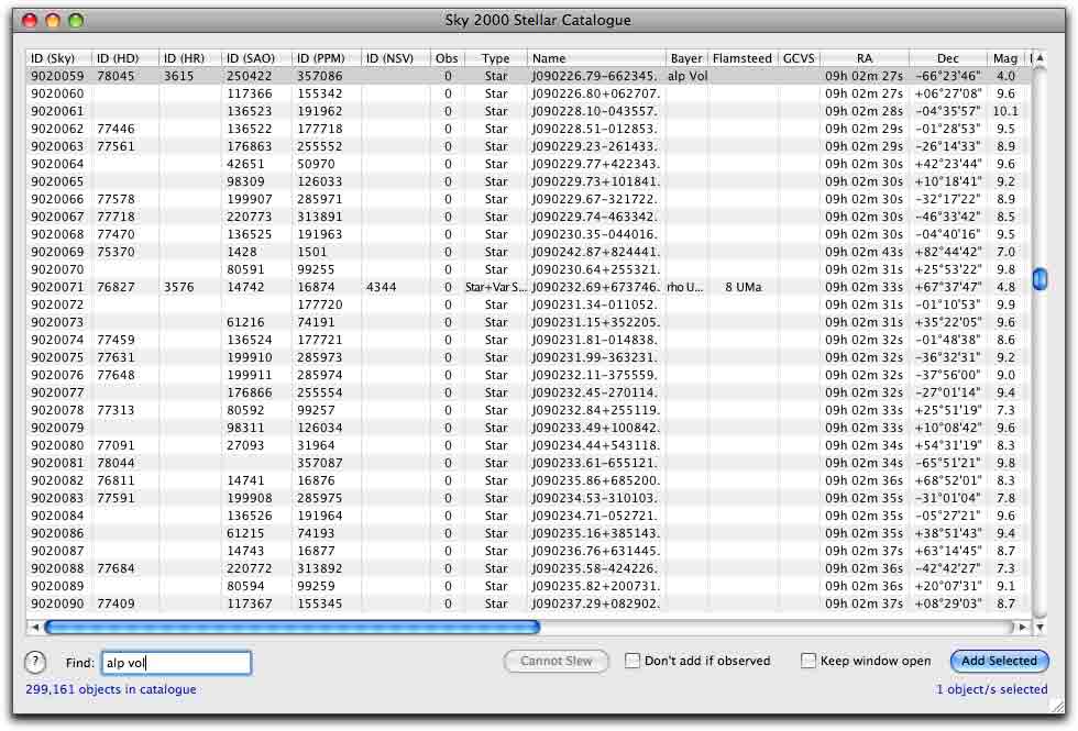
The revised catalogue window has done away with the previous version’s “segmenting” of the catalogue into 100 object chunks, with the awkward Previous and Next buttons. Now the whole catalogue (even if it’s millions of objects in size) is displayed in the listbox. Won’t this be incredibly slow? Not at all. In fact a 2.5 million object catalogue is just as fast as a 100 object catalogue.
The find function is now threaded and works on finding any ID in the catalogue, including Bayer, Flamsteed and GCVS-style IDs.
Eyepiece reticles
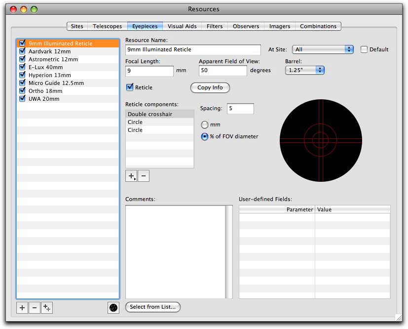
Eyepiece resources can now have reticles associated with them, which you can build from cross hairs, circles, rectangles, etc.
When you use such an eyepiece in the FOV, the reticle will be shown for that eyepiece (yes, there’s an option to disable that).
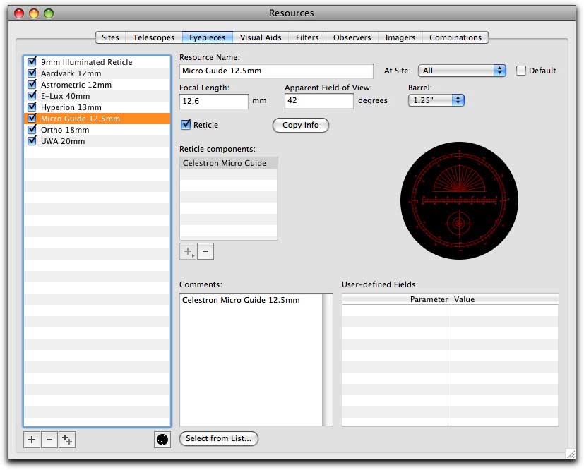
The reticles include the more complex ones, such as the Celestron and Meade astrometric eyepieces.
If you choose your eyepiece from the built-in list of commercial eyepieces, and it has a reticle, the odds are that the reticle information will be included too.
Framework reference
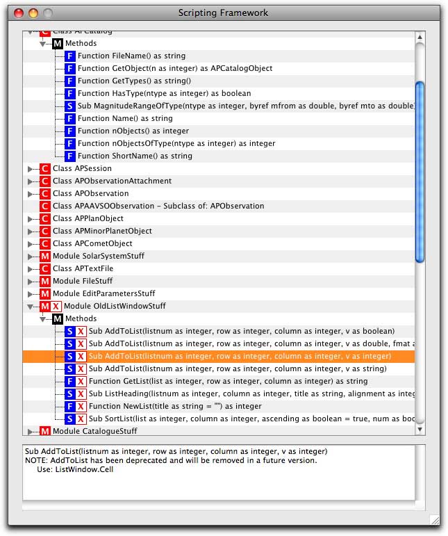
For scripters, there’s a new Framework Reference window. This displays the complete set of classes, methods and functions available to you. It also displays deprecated classes and functions (i.e. those that have been replaced with better (sic) alternatives), together with some notes as to what the replacement code is.
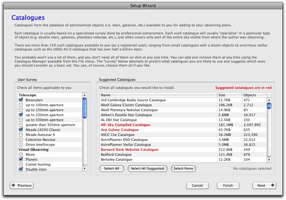
Setup wizard – catalogues
A frequently asked question, especially by new users, is: what are all these catalogues, do I need all of them, which one’s should I install? OK, that’s three questions, but you get the picture.
The Setup Wizard now has a section that helps a new user decide what to install. There’s a whole bunch of survey yes/no questions that takes a stab at determining what your interests are (e.g. imaging DSOs, variable star work, etc.) and what kind of telescopes you’re using. From that information various catalogues are then highlighted.
For example if you only have binoculars, and do visual observing, there’s no point in installing the Hubble GSC catalogue, when smaller and better catalogues will do the trick. If you have an interest in variable stars, but think that double stars are just so 19th-century, then it will suggest the GCVS, but not the WDS.
Of course, these are just suggestions, but it might help baffled new users.
More stuff to come, but less and less major as beta approaches.
Dan Kuchta | 08-Aug-08 at 5:18 pm | Permalink
Very cool!!! I can’t wait!
Gary Ferguson | 09-Aug-08 at 9:47 am | Permalink
This all looks sooo great! I’m trying to stay patient, but it’s getting really hard….
Troy Mullens | 09-Aug-08 at 11:26 am | Permalink
Looks great.
Anxiously waiting.
V1 is working great though.
Troy, in hot Ft. Worth
Chris Ragaisis | 09-Aug-08 at 1:44 pm | Permalink
You’ve got to be kidding! I don’t know how we’re going to wait… The anticipation is maddening!
Pete Smith | 21-Aug-08 at 8:00 am | Permalink
Its a much cleaner look that should be better in night screen mode. I like the additional wizards and the help with scripting.
Looks a great product.
Pete
50:54N 0:34E
Brian Roth | 27-Aug-08 at 11:50 am | Permalink
Being new to Astroplanner I’m looking at the changes differently. Meaning are they just eyecandy or real user interface changes or functionlaity changes. From what I have seen the changes look dramatic to the interface, allowing for enduser ease. I also belive the actual functional enhancements will add to the value of the product.
Brian, Arizona
admin | 27-Aug-08 at 12:00 pm | Permalink
@Brian
There’s no eyecandy in AstroPlanner. It’s a tool, so every feature has its use. Some stuff might look better in V2, but at “worst” its an attempt to make it more “standard” for the OS platform, or to make it easier to comprehend or use for the end-user. The changes to V2 are more evolutionary than revolutionary. If you’re comfortable with V1, you’ll find V2 even more comfortable (with perhaps a small learning curve to figure out where things have moved to.